Cara - Visit Website

Overview
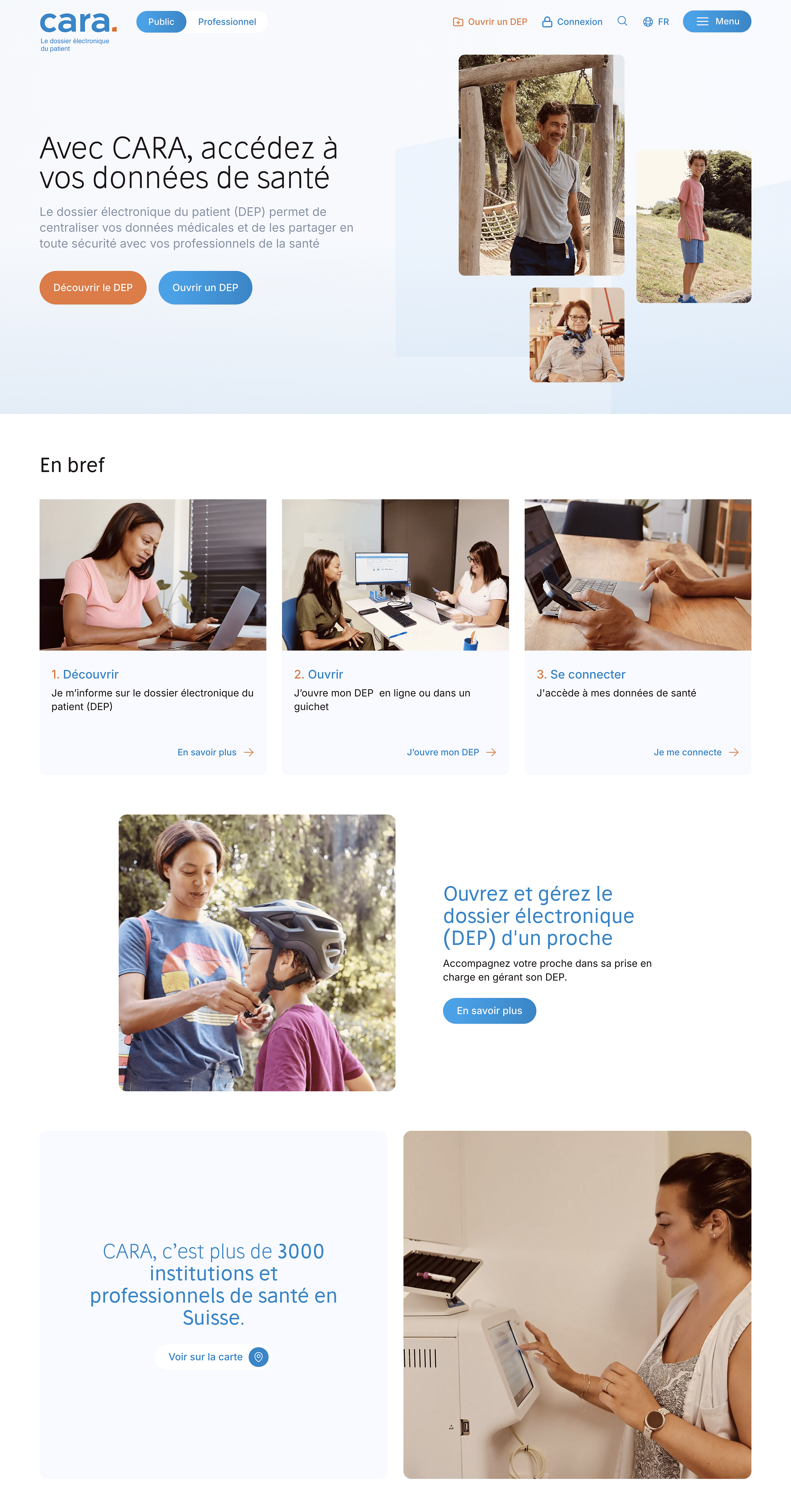
The CARA association commissioned iomedia to redesign its website with a twofold aim: to modernise its digital presence and to make the electronic patient record (EPR) easier for its audiences to understand.
The project also aimed to empower the client through flexible and effective content management tools. An in-depth analysis of the target audiences was carried out beforehand, with the creation of personas to guide UX, functional and editorial decisions.
The site was designed to meet three key needs: to provide information on the EPR, to allow users to register for it and to give them access to their login area.
At the heart of this project, iomedia developed a DEP registration wizard designed to guide users clearly and intuitively through each stage of the process. Fully manageable, this tool enables CARA to adapt the user journey independently, without technical dependency.
| Concept | Information structure |
| Webdesign | Design system, UI / UX, Figma |
| Front | Vue 2, Nuxt 2, Tailwind |
| Back | AIO V3 Headless |
Challenge
User experience at the heart of our strategy.
The main challenge of the project was to design a simple and reassuring user experience around a complex and sensitive subject. We had to accurately identify the different user profiles, understand their expectations and structure a user journey capable of meeting a variety of needs.
Designing the wizard also presented a major challenge, particularly due to differences in processes across cantons. The aim was to provide a clear tool for users, whilst offering the client considerable flexibility in administration.

Mobile
Accessibility on all media
The user experience is designed to adapt to all media. As a result, Internet users can easily consult their content, whatever their device. Loading and display performance ensure that content reads smoothly.


Methodology
Close to our customers' needs.
The project was based on a series of workshops conducted with the client: design workshops, work on target audiences and the functional definition of the wizard. This collaborative approach enabled us to align expectations, clarify requirements and build a coherent, scalable and user-centred solution.
Colors
The choice of colours was guided by a number of factors to ensure optimal harmony and readability. For this project, we followed the guidelines set out in the existing brand guidelines.